Call to Action: 11 Tips for Effective CTA Buttons
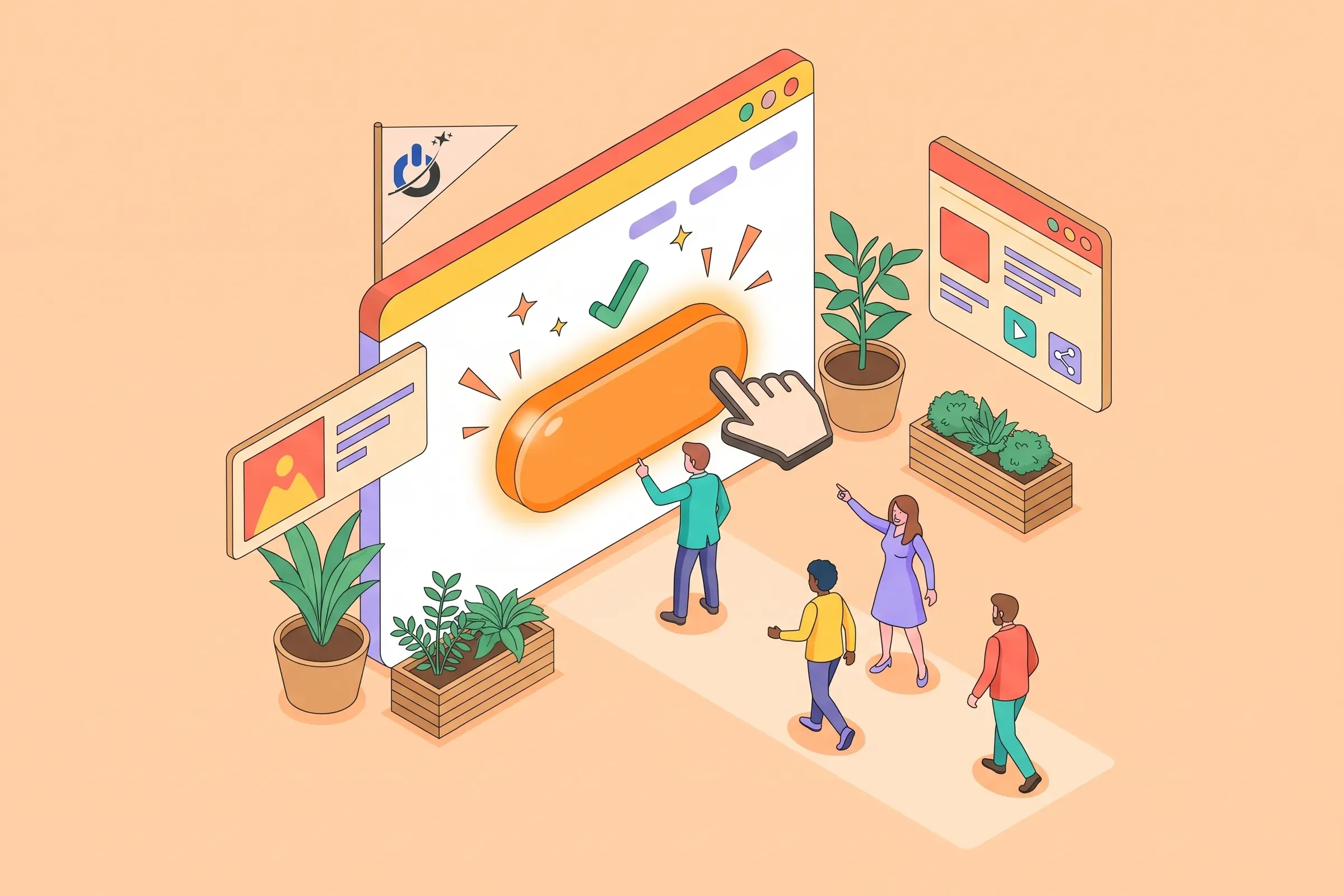
A call to action is the element that turns a visitor into a lead or a customer: a button, a link or a sentence inviting them to take the next step. It is often the smallest element on a page, yet one of those that weigh most on results.
This guide brings together 11 tips for designing an effective call to action button: copy, color, placement, accessibility, number of buttons and how to test them. Before-and-after copy examples, a placement table by page type and a self-check help you improve your own pages.
At a glance
- An effective call to action clearly states what the visitor gets, with an action verb and a concrete benefit.
- Every page should have one main call to action, more visible than secondary actions.
- The button should contrast with the page, be visible without scrolling on mobile and be large enough to tap.
- A reassurance line (free, no commitment, reply within 24 hours) removes the last objections to clicking.
- The best calls to action are measured and tested: copy, color and placement are validated with data.
What is a call to action?
A call to action (CTA) is an element on a web page that invites visitors to take a specific action: request a quote, buy, book, subscribe to a newsletter, download a guide, call. It usually takes the form of a button, but can also be a text link, a banner or a pop-up.
The CTA is the bridge between interest and action. A page can convince the visitor, but if the next step is not obvious, they leave without doing anything.
Types of calls to action
- Conversion CTA: request a quote, buy, book a meeting. This is the page’s main goal.
- Lead generation CTA: download a guide, register for a webinar, get a report, in exchange for an email address.
- Navigation CTA: explore an offer, read a related article, see pricing. It guides visitors to the next page.
- Engagement CTA: leave a review, share content, follow the brand.
11 tips for an effective call to action
1. Copy that states a benefit
Button text should say what the visitor will get, not the technical action they perform. “Submit” or “Confirm” describe a gesture; “Get my quote” or “Download the guide” describe a result. The button is often the only part of the page visitors read before clicking.
| Vague text | Effective text | Why |
|---|---|---|
| Submit | Get my free quote | States what the visitor gets, not the technical action |
| Learn more | See the 3 plans and prices | Says what is behind the click |
| Sign up | Send me the guide | Highlights the benefit rather than the effort |
| Buy | Add to cart, 2-day delivery | Adds information that removes an objection |
| Click here | Book my 30-minute consultation | Describes the action and its length, which also helps accessibility |
2. An action verb, up front
Start with a verb: book, get, discover, try, compare. Avoid passive wording or bare nouns (“Registration”, “Contact”), which invite nothing.
3. Short, specific copy
Two to five words are usually enough. If a detail helps (duration, price, delay), place it just below the button rather than inside it. A button that wraps onto three lines on mobile loses readability.
4. First person when it feels natural
“Get my quote” or “Create my account” help visitors picture themselves taking the action. First person works well for actions that directly concern the visitor; for navigation buttons (“See pricing”), neutral wording feels more natural. Test both on your key pages.
5. Honest urgency, and only when it is real
A real deadline, limited stock or a launch offer can speed up decisions. Fake urgency (a countdown that restarts on every visit) is quickly noticed and destroys trust, and it is considered a deceptive practice in many countries.
6. A reassurance line next to the button
Last-minute hesitation often disappears with a short note: “free, no commitment”, “reply within one business day”, “free cancellation”, “secure payment”. Place it under the button, in smaller type, without pulling attention away from the action.

7. A button that cannot be missed
The main CTA should be spotted at a glance: sufficient size, a recognizable button shape, white space around it. On mobile, it should be visible without scrolling on pages where action is immediate (product page, landing page). WCAG 2.2 accessibility rules require a target area of at least 24 × 24 CSS pixels and recommend 44 × 44 at the strictest level: aim for the larger value for a main button.
8. A color that contrasts
There is no magic color: red does not always beat green, nor orange beat blue. What matters is contrast with the rest of the page and consistency: the main CTA color should be used only for main actions. Also check the contrast between button text and background so it stays readable for everyone.
9. The right placement for the page
Place the CTA where visitors are ready to act: after the decisive argument, next to the price, at the end of an article. On a long page, repeat it several times rather than keeping it for the bottom.
| Page type | Main call to action | Recommended placement |
|---|---|---|
| Home page | Explore the main offer or request a quote | Above the fold, repeated at the bottom |
| Service page | Request a quote, book a call | After the benefit is explained, then at the end |
| Product page | Add to cart | Next to price and options, visible without scrolling on mobile |
| Blog post | Download a guide, subscribe, discover a related service | Mid-article (in context) and at the end |
| Landing page | One single action tied to the ad | Above the fold, then after each key argument |
10. One main call to action per page
Too many equally weighted buttons make visitors hesitate. Choose each page’s main action and give it visual priority; secondary actions (“Learn more”, “Call us”) can exist, but as a link or a quieter button. On a landing page tied to a campaign, stick to a single action.
11. Measure and test regularly
Track CTA clicks in Google Analytics 4 (click or form events) and page conversion rates. Then test one variable at a time: copy, color, placement, reassurance line. An A/B test needs enough traffic to reach a conclusion; on a small site, compare two periods of a few weeks instead.
Your site gets traffic but few enquiries? Redesign your pages to convert more visitors
The call to action behind the button: the form
A perfect button is useless if the next page discourages visitors. A quote request form should ask only for the essentials: name, contact method, need. Every extra field reduces the number of requests. For an online store, the checkout plays the same role: shipping fees revealed late and forced account creation are classic friction points.
Calls to action and landing pages
On a landing page tied to a Google Ads campaign or an email, the CTA must echo the ad’s promise. If the ad promises a “free audit”, the button should say “Request my free audit”, not “Contact us”. This consistency between ad, page and button improves both conversion rate and ad Quality Score.
Common call to action mistakes
- “Click here” or “Learn more” everywhere, without saying what lies behind.
- A button in the same color as everything else, blending into the page.
- A CTA only at the bottom of a long page.
- Dozens of competing buttons on the home page.
- A tiny button on mobile, right next to another link.
- Fake urgency that erodes trust.
- No click tracking, so no possible improvement.
Self-check: are your calls to action effective?

Conclusion: a clear call to action beats an original button
An effective call to action is nothing spectacular: copy that states a benefit, a visible button placed at the right moment, a reassuring line and a short form behind it. These details, tested and measured, make the difference between a page that informs and a page that converts.
Our advice: start with your three most visited pages. Rewrite their main button copy, check how it displays on mobile and track clicks for a month before going further. For more on conversion, see our guide on how to increase online sales.
Frequently asked questions about call to action buttons
What is a call to action on a website?
A call to action is an element that invites visitors to take a specific action: request a quote, buy, book, subscribe or download content. It usually takes the form of a button, but can also be a link or a banner. It is the bridge between the visitor’s interest and the conversion.
How do I write effective call to action copy?
Start with an action verb and state what the visitor gets: “Get my quote”, “Download the guide”, “Book my consultation”. Keep it short, two to five words, and add a detail under the button if needed (free, no commitment, response time). Avoid vague text such as “Submit” or “Click here”.
Where should I place a call to action button?
Place it where visitors are ready to act: above the fold on a landing page, next to the price on a product page, after the decisive argument on a service page, mid-article and at the end of a blog post. On a long page, repeat the main CTA several times rather than keeping it for the bottom.
What color should a call to action button be?
No color is best in absolute terms. Choose one that contrasts clearly with the rest of the page and reserve it for main actions. Check that the text stays readable on the button background, then test if your traffic allows. Consistency and contrast matter more than the hue itself.
How many call to action buttons should a page have?
A page should have one main action, visually emphasized, which can be repeated several times on a long page. Secondary actions can exist, but with less visual weight. On a landing page tied to a campaign, it is best to limit yourself to a single action.
What accessibility rules apply to a call to action button?
The button text must describe the action even when read alone by a screen reader. Text and background contrast must be sufficient, the target area must be at least 24 × 24 CSS pixels under WCAG 2.2 (44 × 44 recommended), and the button must be usable with a keyboard, with a visible focus state.